When we talk about website accessibility, we mean the practice of designing and developing websites that ensure they can be used by as many people as possible, regardless of their abilities or disabilities.
For example, building your website so that visually impaired people can use it.
What is WCAG?
The Web Content Accessibility Guidelines (WCAG) are a set of international standards drawn up by the W3C (World Wide Web Consortium).
Created in 1998, the WCAG aims to make the web accessible to everyone, regardless of their physical, sensory or intellectual abilities.
Several countries have adopted the WCAG as a reference for public policies on digital accessibility, including Portugal.
Although there is no specific law on WCAG in Portugal, some Portuguese government guidance documents refer to WCAG.
For those who have also heard of the ADA, it is necessary to emphasise that WCAG is not exactly the same as the Americans with Disabilities Act (ADA).
ADA is a specific US law that prohibits discrimination against people with disabilities.
WCAG, on the other hand, is a set of technical recommendations for making the web accessible to everyone.
By adopting WCAG, a more inclusive online environment is created, allowing everyone to take full advantage of the resources and services offered on the web.

Talking about the Guidelines
These guidelines cover a wide range of recommendations on how to make web content understandable, operable, comprehensible and robust.
These are really the 4 fundamental principles that form the basis of all the WCAG guidelines, currently in version 2.1 since September 2023:
- Perceptible: Web content must be perceived by all users, regardless of their sensory impairments.
- Operable: The user interface must be operable, i.e. the content must be accessible and easy to use for people with motor and navigational disabilities.
- Understandable: The information and user interface must be understandable.
- Robust: The content must be robust and compatible with a wide range of current and future assistive technologies and computing environments.
Each of these 4 principles is divided into guidelines.
For each guideline there are specific action criteria or success criteria and information techniques that can be of the sufficient or advisory type.
It’s not possible to list all the points to respect as WCAG 2.1 covers a wide range of areas, but you can consult everything you need on the W3 accessibility website.
Accessibility benefits
There are a number of reasons and advantages to making your website accessible.
1. Compliance
Let’s start with compliance, since in many countries there are laws and regulations that require web accessibility.
We mentioned one of the countries above, the USA, where the Americans with Disabilities Act (ADA) and the Web Content Accessibility Guidelines (WCAG) are widely adopted and mandatory standards.
2. Ethical reasons
Ensuring that websites are accessible reflects a commitment to inclusion and ethical design practices.
It recognises the diverse needs of users and respects their right to access information and services online.
3. Benefits for e-commerce
Accessible websites can reach more people, including people with disabilities.
This not only increases the potential user base, but also improves the overall user experience.
4. SEO
Another aspect that benefits from good accessibility practices is undoubtedly SEO.
By making websites more accessible we are also helping search engines to understand them.
One of the WCAG directives is to have one and only one Heading 1 (H1) on each page, making websites more accessible; this is also one of the good SEO practices that helps search engines understand the content of each page.
The 4 Principles of WCAG
As we mentioned earlier, the principles of web accessibility include perceivability, operability, understandability, and robustness.
But what do each of these principles mean?
Perceivability: The Basic Principle of WCAG Web Accessibility
Perceptibility is the first principle of the WCAG and ensures that the information and components of a website are presented clearly and easily understandable by all users, regardless of their visual, auditory, or cognitive abilities.
Let’s take a look at some practical examples of the Perceptibility principle:
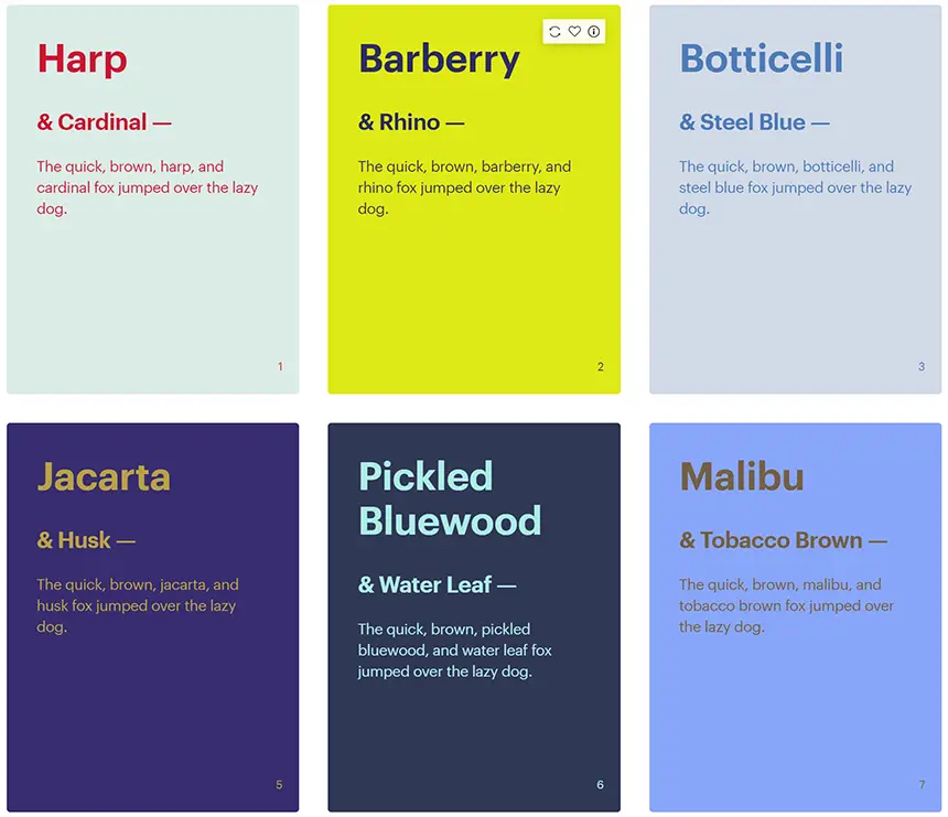
- Text with sufficient contrast: The text on your site should have colours that contrast appropriately with the background of the page. For example, avoid light grey text on a white background, as this makes it difficult to read for people with visual problems.
- Images with alternative text: Images that convey relevant information should have an alternative text description (alternative text), helping visually impaired people to understand the content of the image as this alternative text is read by screen readers.
- Multimedia content with subtitles and transcripts: Videos and audio files should offer descriptive subtitles and transcripts of the spoken content, benefiting people who are deaf or hard of hearing.
- Text resizing: Text should allow magnification without losing legibility, helping people with low vision.
WCAG Operability Principle: Making the site manageable.
The second WCAG principle is Operability which ensures that users can operate all the elements of a web page, and navigate through it, using different interfaces such as keyboard, mouse or voice command devices.
Examples of how to guarantee Operability on your site:
- Keyboard for navigation: All the site’s functionalities should be accessible via the keyboard, without the need to use a mouse. This is essential for people with motor disabilities.
- Keyboard shortcuts: Common keyboard shortcuts, such as “TAB” to change focus and “ENTER” to activate, must work correctly.
- Clearly labelled elements: Each element on the page must be clearly and descriptively labelled, allowing assistive technologies such as screen readers to interpret the content. We’re also talking about forms and interactive components that should have descriptive labels, making it easier to understand their function.
- Avoid flashing content: flashing Flash or content that updates automatically can cause epileptic seizures in some users. Allowing the user to pause or deactivate this type of content is a good practice.
- Sufficient time for reading and use: Content that disappears quickly or requires immediate responses should give the user enough time to process the information and be able to interact.
WCAG comprehensibility: Clear and simple information for everyone
The third principle of the WCAG is Comprehensibility. This principle ensures that the information and structure of the web page is clear and well organised, making it easy to understand for users with different cognitive and literacy levels.
Here are some tips for making websites understandable:
- Simple and objective language: Avoid technical jargon and complex sentences. Use common terms and construct accessible sentences.
- Clear structure: Organise content logically, with well-defined headings, subheadings, and separations.
- Descriptive alternative text: Complex images should have detailed descriptions explaining their content.
- Clear instructions: Provide easy-to-understand, step-by-step instructions for forms and interactive processes.
- Precise meaning: Assign a clear meaning to abbreviations and acronyms, explaining them on first use.
- Reading support: Allow text to be enlarged and offer text alternatives to multimedia content.
Robustness Principle: Robust and updatable content
The last principle of the WCAG is robustness or rather robust content.
Under this principle, content must be robust enough to be interpreted by a wide variety of user agents.
Content must be compatible with current and future user tools, including assistive technologies.
Examples include:
- Avoid outdated technologies: Old technologies may not work well with screen readers and other programmes used by people with disabilities. Keep up to date with current web technologies.
- Use semantic code: Use HTML tags correctly to identify different parts of your page, such as headings, paragraphs and tables. This allows assistive technologies to better interpret the content.
Technology and content
To fulfil all these principles and the guidelines that make them up, there are two aspects that are important and that must be taken care of separately and together.
These are the technology used and the content of the websites.
Fortunately, many platforms and page editors already use the technology needed for built-in accessibility.
There’s no need for any extra coding or CSS work, but when we design a page, we’re responsible for the content and design.
Let’s take, for example, two of the most widely used platforms for online shops: Shopify and Woocommerce with WordPress as its core.
According to the information on the Shopify website, the platform follows the WCAG when it comes to its development.
You can read about this on the Shopify Accessibility Compliance Report – WCAG Edition page.
However, when it comes to customised themes, accessibility depends on who develops the Shopify theme and content. You can read more in the guide to accessibility for themes on the Shopify website.
Similarly, WordPress core and official themes follow the WCAG according to WordPress.org.
But for third-party themes, accessibility depends on who develops the themes and their content.
To support the good practices “imposed” by the WCAG, the WordPress organisation offers a plugin that helps with a variety of common accessibility problems in WordPress themes, although most accessibility problems cannot be solved without directly changing the theme.
WP Accessibility adds a few useful accessibility features with a minimum of configuration or specialised knowledge.
The same is true of some theme developers such as Elementor, who say all you need to do is provide accessible content and this well-known WordPress plugin does the rest. It does, however, warn of some good practices to make content more accessible.
Some good practice tips.
Here are some points you should respect:
Title structure
Make sure your title structure is clear and well-defined.
Before creating your page, try to divide the content into different types of headings.
For example, if your content has categories, subcategories and topics, categories are identified as H2, subcategories as H3 and topics as H4.
Other elements or widgets should also contain titles that identify them.
Main title
Each page should have one, and only one, H1 tag (Title 1).
This is essential for good accessibility and the most important for search engines.
Skip to Content” link
Having a skip-to-content button that is only visible to screen readers is very important.
It allows these readers to jump to the content of the page with just one click.
Although this function works with the default layout in some themes, in others you have to select a specific element on the page and define a personalised “content” CSS ID so that the reader can find it.
Alternative image text
Make sure that all images have the alternative text field filled in.
Bear in mind that both blind readers and search engines use the alternative text to understand the image, so the more detailed the description, the better.
This is also one of the main points for image search engines, and for SEO for images, so it’s worth respecting.
Semantic reference elements
Semantic reference elements are HTML tags that contain specific information. Use wrappers as reference elements in headers and footers to help screen readers identify these parts of the website and keep users focused on the content of the page. Mark up headers and footers using the header and footer settings.
Colour contrast

Colour contrast is another important element in making websites accessible to people with visual impairments.
For people with low vision or colour blindness, proper colour contrast ensures that text and important elements stand out clearly against the background. This increases readability and comprehension.
It is crucial to consider colour combinations that adapt to various forms of colour vision deficiencies, ensuring inclusion and equal access to information for all users.
By prioritising colour contrast in web design, developers promote accessibility and create a more inclusive online experience for people with visual impairments.
ARIA labels
ARIA tags are a set of attributes that provide additional information to assistive technologies such as screen readers.
These tags improve accessibility by providing users with alternative means of understanding web content.
For example, an icon is not very useful for visually impaired people, so developers should provide an ARIA tag that describes icons, buttons, and other visual elements.
How do you test for WCAG compliance?
Even if we comply with the suggested best practices, we always want to check that we comply with all the guidelines.
Accessibility evaluation tools automatically test the structure of the code to check that it complies with the WCAG.
There are other tools that help you make decisions about certain aspects of design, such as colour contrast.
Here is the address of AMA – Agência para a Modernização Administrativa (Agency for Administrative Modernisation) where you can find some of these tools as well as guidelines from various software and hardware manufacturers. This site is only in Portuguese language.
We suggest two accessibility testing tools, one an extension for browsers for a quick analysis, and the other directly on the platform by pasting the URL of the site to be analysed:
WAVE
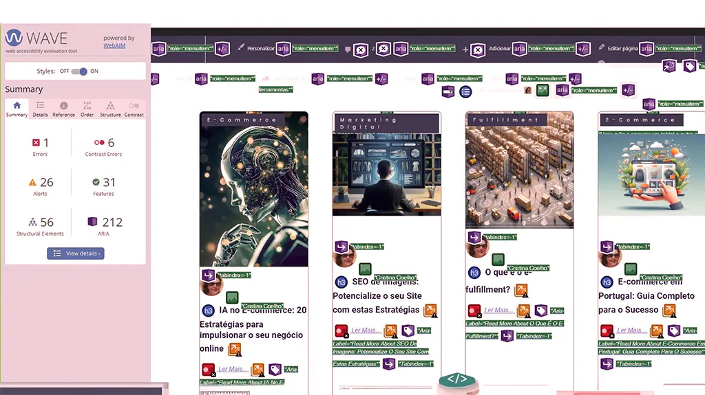
The Wave extension is a web accessibility evaluation tool developed by WebAIM.org.
It is installed as an extension and is available for Chrome, Edge and Firefox.
It provides visual feedback on the accessibility of your web content by injecting icons and indicators into the analysed page.
There is no automated tool that can tell whether a page complies with accessibility rules 100 per cent, but WAVE facilitates human evaluation and educates on accessibility issues.
All the analysis is carried out entirely in the browser used, allowing for a secure evaluation.

To run a WAVE report, simply click on the WAVE icon or select “WAVE this page” from the context menu.
WAVE already detects non-conformities according to WCAG 2.2. and its interface facilitates human evaluation of many other aspects of accessibility and the Web Content Accessibility Guidelines and ADA Section 508 compliance.
Access Monitor
Access Monitor was developed in 2009 by the Foundation for Science and Technology (FCP). It generates a fairly simple report with some tips for correcting any errors found, as well as giving the site a score from 0 to 10 in terms of accessibility.
It allows you to test with both versions of WCAG, 1.0 and 2.0, but it is recommended that you always test with the most up-to-date version.
Conclusion
WCAG stands for Web Content Accessibility Guidelines.
The WCAG principles and guidelines are a set of recommendations for making websites more accessible to people with disabilities.
There are four fundamental WCAG principles: perceivability, operability, understandability and robustness. Each principle has specific guidelines that must be followed to ensure the accessibility of content.
To make a website accessible, it is important to use simple and objective language, organise content in a clear and logical way, provide alternative descriptions for complex images and offer clear instructions for forms and interactive processes.
It is necessary to ensure that the content is compatible with a wide range of assistive technologies, such as screen readers, and that it is understandable to people with different cognitive and literacy levels.
Web accessibility not only benefits people with disabilities, but also improves the user experience in general and can have a positive impact on the SEO (Search Engine Optimisation) of each page.
In short, it’s important to follow the WCAG guidelines to make websites more accessible, not only for ethical and compliance reasons, but also because they help optimise pages for search engines and increase the target audience when it comes to e-commerce.
It should also be noted that the Electronic and Digital Accessibility Act is already in force for the Public Administration and will come into force for all companies and individuals from 28 June 2025.


